List
-
class
vanilla.List(posSize, items, dataSource=None, columnDescriptions=None, showColumnTitles=True, selectionCallback=None, doubleClickCallback=None, editCallback=None, menuCallback=None, enableDelete=False, enableTypingSensitivity=False, allowsMultipleSelection=True, allowsEmptySelection=True, allowsSorting=True, drawVerticalLines=False, drawHorizontalLines=False, autohidesScrollers=True, drawFocusRing=True, rowHeight=17.0, selfDropSettings=None, selfWindowDropSettings=None, selfDocumentDropSettings=None, selfApplicationDropSettings=None, otherApplicationDropSettings=None, dragSettings=None)¶ A control that shows a list of items. These lists can contain one or more columns.
A single column example:
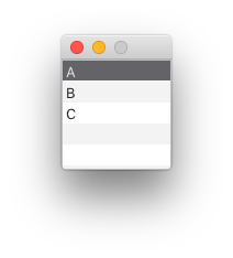
from vanilla import Window, List

class ListDemo:

    def __init__(self):
        self.w = Window((100, 100))
        self.w.myList = List((0, 0, -0, -0), ["A", "B", "C"],
                     selectionCallback=self.selectionCallback)
        self.w.open()

    def selectionCallback(self, sender):
        print(sender.getSelection())

ListDemo()
A multiple column example:
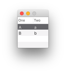
from vanilla import Window, List

class ListDemo:

    def __init__(self):
        self.w = Window((100, 100))
        self.w.myList = List((0, 0, -0, -0),
                     [{"One": "A", "Two": "a"}, {"One": "B", "Two": "b"}],
                     columnDescriptions=[{"title": "One"}, {"title": "Two"}],
                     selectionCallback=self.selectionCallback)
        self.w.open()

    def selectionCallback(self, sender):
        print(sender.getSelection())

ListDemo()
List objects behave like standard Python lists. For example, given this List:
self.w.myList = List((10, 10, 200, 100), ["A", "B", "C"])
The following Python list methods work:
# Getting the length of the List.
>>> len(self.w.myList)
3

# Retrieving an item or items from a List.
>>> self.w.myList[1]
"B"
>>> self.w.myList[:2]
["A", "B"]

# Setting an item in a List.
>>> self.w.myList[1] = "XYZ"
>>> self.w.myList.get()
["A", "XYZ", "C"]

# Deleting an item at an index in a List.
>>> del self.w.myList[1]
>>> self.w.myList.get()
["A", "C"]

# Appending an item to a List.
>>> self.w.myList.append("Z")
>>> self.w.myList.get()
["A", "B", "C", "Z"]

# Removing the first occurance of an item in a List.
>>> self.w.myList.remove("A")
>>> self.w.myList.get()
["B", "C"]

# Getting the index for the first occurance of an item in a List.
>>> self.w.myList.index("B")
1

# Inserting an item into a List.
>>> self.w.myList.insert(1, "XYZ")
>>> self.w.myList.get()
["A", "XYZ", "B", "C"]

# Extending a List.
>>> self.w.myList.extend(["X", "Y", "Z"])
>>> self.w.myList.get()
["A", "B", "C", "X", "Y", "Z"]

# Iterating over a List.
>>> for i in self.w.myList:
>>>     i
"A"
"B"
"C"
posSize Tuple of form (left, top, width, height) or “auto” representing the position and size of the list.
items The items to be displayed in the list. In the case of multiple column lists, this should be a list of dictionaries with the data for each column keyed by the column key as defined in columnDescriptions. If you intend to use a dataSource, items must be None.
dataSource A Cocoa object supporting the NSTableViewDataSource protocol. If dataSource is given, items must be None.
columnDescriptions An ordered list of dictionaries describing the columns. This is only necessary for multiple column lists.
“title” The title to appear in the column header. “key” (optional) The key from which this column should get its data from each dictionary in items. If nothing is given, the key will be the string given in title. “formatter” (optional) An NSFormatter for controlling the display and input of the column’s cells. “cell” (optional) A cell type to be displayed in the column. If nothing is given, a text cell is used. “editable” (optional) Enable or disable editing in the column. If nothing is given, it will follow the editability of the rest of the list. “width” (optional) The width of the column. “minWidth” (optional) The minimum width of the column. The fallback is width. “maxWidth” (optional) The maximum width of the column. The fallback is width. “allowsSorting” (optional) A boolean representing that this column allows the user to sort the table by clicking the column’s header. The fallback is True. If a List is set to disallow sorting the column level settings will be ignored. “typingSensitive” (optional) A boolean representing that this column should be the column that responds to user key input. Only one column can be flagged as True. If no column is flagged, the first column will automatically be flagged. binding (optional) A string indicating which binding object the column’s cell should be bound to. By default, this is “value”. You should only override this in very specific cases. showColumnTitles Boolean representing if the column titles should be shown or not. Column titles will not be shown in single column lists.
selectionCallback Callback to be called when the selection in the list changes.
doubleClickCallback Callback to be called when an item is double clicked.
editCallback Callback to be called after an item has been edited.
menuCallback Callback to be called when a contextual menu is requested.
enableDelete A boolean representing if items in the list can be deleted via the interface.
enableTypingSensitivity A boolean representing if typing in the list will jump to the closest match as the entered keystrokes. Available only in single column lists.
allowsMultipleSelection A boolean representing if the list allows more than one item to be selected.
allowsEmptySelection A boolean representing if the list allows zero items to be selected.
allowsSorting A boolean indicating if the list allows user sorting by clicking column headers.
drawVerticalLines Boolean representing if vertical lines should be drawn in the list.
drawHorizontalLines Boolean representing if horizontal lines should be drawn in the list.
drawFocusRing Boolean representing if the standard focus ring should be drawn when the list is selected.
rowHeight The height of the rows in the list.
autohidesScrollers Boolean representing if scrollbars should automatically be hidden if possible.
selfDropSettings A dictionary defining the drop settings when the source of the drop is this list. The dictionary form is described below.
selfWindowDropSettings A dictionary defining the drop settings when the source of the drop is contained the same window as this list. The dictionary form is described below.
selfDocumentDropSettings A dictionary defining the drop settings when the source of the drop is contained the same document as this list. The dictionary form is described below.
selfApplicationDropSettings A dictionary defining the drop settings when the source of the drop is contained the same application as this list. The dictionary form is described below.
otherApplicationDropSettings A dictionary defining the drop settings when the source of the drop is contained an application other than the one that contains this list. The dictionary form is described below.
The drop settings dictionaries should be of this form:
type A single drop type indicating what drop types the list accepts. For example, “NSFilenamesPboardType” or “MyCustomPboardType”. operation (optional) A drag operation that the list accepts. The default is NSDragOperationCopy. allowDropBetweenRows (optional) A boolean indicating if the list accepts drops between rows. The default is True. allowDropOnRow (optional) A boolean indicating if the list accepts drops on rows. The default is False. callback Callback to be called when a drop is proposed and when a drop is to occur. This method should return a boolean representing if the drop is acceptable or not. This method must accept sender and dropInfo arguments. The dropInfo will be a dictionary as described below. The dropInfo dictionary passed to drop callbacks will be of this form:
data The data proposed for the drop. This data will be of the type specified by dropDataFormat. rowIndex The row where the drop is proposed. source The source from which items are being dragged. If this object is wrapped by Vanilla, the Vanilla object will be passed as the source. dropOnRow A boolean representing if the row is being dropped on. If this is False, the drop should occur between rows. isProposal A boolean representing if this call is simply proposing the drop or if it is time to accept the drop. -
addAutoPosSizeRules(rules, metrics=None)¶ Add auto layout rules for controls/view in this view.
rules must be a list of rule definitions. Rule definitions may take two forms:
- strings that follow the Visual Format Language
- dictionaries with the following key/value pairs:
key value “view1” The vanilla wrapped view for the left side of the rule. “attribute1” The attribute of the view for the left side of the rule. See below for options. “relation” (optional) The relationship between the left side of the rule and the right side of the rule. See below for options. The default value is “==”. “view2” The vanilla wrapped view for the right side of the rule. “attribute2” The attribute of the view for the right side of the rule. See below for options. “multiplier” (optional) The constant multiplied with the attribute on the right side of the rule as part of getting the modified attribute. The default value is 1. “constant” (optional) The constant added to the multiplied attribute value on the right side of the rule to yield the final modified attribute. The default value is 0. The attribute1 and attribute2 options are:
value AppKit equivalent “left” NSLayoutAttributeLeft “right” NSLayoutAttributeRight “top” NSLayoutAttributeTop “bottom” NSLayoutAttributeBottom “leading” NSLayoutAttributeLeading “trailing” NSLayoutAttributeTrailing “width” NSLayoutAttributeWidth “height” NSLayoutAttributeHeight “centerX” NSLayoutAttributeCenterX “centerY” NSLayoutAttributeCenterY “baseline” NSLayoutAttributeBaseline “lastBaseline” NSLayoutAttributeLastBaseline “firstBaseline” NSLayoutAttributeFirstBaseline Refer to the NSLayoutAttribute documentation for the information about what each of these do.
The relation options are:
value AppKit equivalent “<=” NSLayoutRelationLessThanOrEqual “==” NSLayoutRelationEqual “>=” NSLayoutRelationGreaterThanOrEqual Refer to the NSLayoutRelation documentation for the information about what each of these do.
metrics may be either None or a dict containing key value pairs representing metrics keywords used in the rules defined with strings.
-
enable(onOff)¶ Enable or disable the object. onOff should be a boolean.
-
get()¶ Get the list of items in the list.
-
getNSScrollView()¶ Return the NSScrollView that this object wraps.
-
getNSTableView()¶ Return the NSTableView that this object wraps.
-
getPosSize()¶ The position and size of the object as a tuple of form (left, top, width, height).
-
getSelection()¶ Get a list of indexes of selected items in the list.
-
isVisible()¶ Return a bool indicating if the object is visible or not.
-
move(x, y)¶ Move the object by x units and y units.
-
resize(width, height)¶ Change the size of the object to width and height.
-
scrollToSelection()¶ Scroll the selected rows to visible.
-
set(items)¶ Set the items in the list.
items should follow the same format as described in the constructor.
-
setPosSize(posSize, animate=False)¶ Set the position and size of the object.
posSize A tuple of form (left, top, width, height).
animate A boolean flag telling to animate the transition. Off by default.
-
setSelection(selection)¶ Set the selected items in the list.
selection should be a list of indexes.
-
show(onOff)¶ Show or hide the object.
onOff A boolean value representing if the object should be shown or not.
-
List Item Cells
-
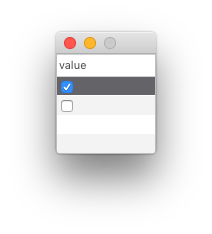
vanilla.CheckBoxListCell(title=None)¶ An object that displays a check box in a List column.
Note
This object should only be used in the columnDescriptions argument during the construction of a List.
from vanilla import Window, List, CheckBoxListCell

class CheckBoxListCellDemo:

    def __init__(self):
        self.w = Window((100, 100))
        self.w.myList = List((0, 0, -0, -0),
                     [{"value": True}, {"value": False}],
                     columnDescriptions=[{"title": "value", "cell": CheckBoxListCell()}],
                     editCallback=self.editCallback)
        self.w.open()

    def editCallback(self, sender):
        print(sender.get())

CheckBoxListCellDemo()
title The title to be set in all items in the List column.
-
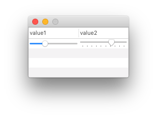
vanilla.SliderListCell(minValue=0, maxValue=100, tickMarkCount=None, stopOnTickMarks=False)¶ An object that displays a slider in a List column.
Note
This object should only be used in the columnDescriptions argument during the construction of a List.
from vanilla import Window, List, SliderListCell

class SliderListCellDemo:

    def __init__(self):
        self.w = Window((200, 100))
        self.w.myList = List((0, 0, -0, -0),
                    [{"value1": 30, "value2": 70}],
                    columnDescriptions=[
                        {"title": "value1", "cell": SliderListCell()},
                        {"title": "value2", "cell": SliderListCell(tickMarkCount=10)},
                    ],
                    editCallback=self.editCallback)
        self.w.open()

    def editCallback(self, sender):
        print(sender.get())

SliderListCellDemo()
minValue The minimum value for the slider.
maxValue The maximum value for the slider.
tickMarkCount The number of tick marcks to be displayed on the slider. If None is given, no tick marks will be displayed.
stopOnTickMarks Boolean representing if the slider knob should only stop on the tick marks.
-
vanilla.PopUpButtonListCell(items)¶ An object that displays a pop up list in a List column.
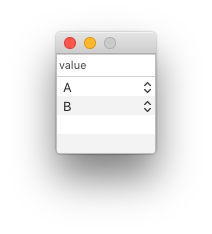
Note
When using this cell in a List, the binding in the column description must be set to selectedValue.
from vanilla import Window, List, PopUpButtonListCell

class PopUpButtonListCellDemo:

    def __init__(self):
        self.w = Window((100, 100))
        self.w.myList = List((0, 0, -0, -0),
                    [{"value": "A"}, {"value": "B"}],
                    columnDescriptions=[{
                        "title": "value",
                        "cell": PopUpButtonListCell(["A", "B", "C"]),
                        "binding": "selectedValue"
                    }],
                    editCallback=self.editCallback)
        self.w.open()

    def editCallback(self, sender):
        print(sender.get())

PopUpButtonListCellDemo()
items The items that should appear in the pop up list.
-
vanilla.ImageListCell(horizontalAlignment='center', verticalAlignment='center', scale='proportional')¶ An object that displays an image in a List column.
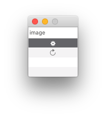
from AppKit import NSImage
from vanilla import Window, List, ImageListCell

class ImageListCellDemo:

    def __init__(self):
        self.w = Window((100, 100))
        self.w.myList = List((0, 0, -0, -0),
                    [
                        {"image": NSImage.imageNamed_("NSActionTemplate")},
                        {"image": NSImage.imageNamed_("NSRefreshTemplate")}
                    ],
                    columnDescriptions=[
                        {"title": "image", "cell": ImageListCell()}
                    ])
        self.w.open()

ImageListCellDemo()
horizontalAlignment A string representing the desired horizontal alignment of the image in the view. The options are:
“left” Image is aligned left. “right” Image is aligned right. “center” Image is centered. verticalAlignment A string representing the desired vertical alignment of the image in the view. The options are:
“top” Image is aligned top. “bottom” Image is aligned bottom. “center” Image is centered. scale A string representing the desired scale style of the image in the view. The options are:
“proportional” Proportionally scale the image to fit in the view if it is larger than the view. “fit” Distort the proportions of the image until it fits exactly in the view. “none” Do not scale the image.
-
vanilla.SegmentedButtonListCell(segmentDescriptions)¶ An object that displays a segmented button in a List column.
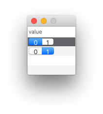
Note
When using this cell in a List, the binding in the column description must be set to selectedIndex.
from vanilla import Window, List, SegmentedButtonListCell

class SegmentedButtonListCellDemo:

    def __init__(self):
        self.w = Window((100, 100))
        self.w.myList = List((0, 0, -0, -0),
                    [{"value": 0}, {"value": 1}],
                    columnDescriptions=[
                        {
                            "title": "value",
                            "cell": SegmentedButtonListCell([dict(title="0"), dict(title="1")]),
                            "binding": "selectedIndex"
                        }
                    ],
                    editCallback=self.editCallback)
        self.w.open()

    def editCallback(self, sender):
        print(sender.get())

SegmentedButtonListCellDemo()
segmentDescriptions An ordered list of dictionaries describing the segments.
title (optional) The title of the segment. imagePath (optional) A file path to an image to display in the segment. imageNamed (optional) The name of an image already loaded as a NSImage by the application to display in the segment. imageObject (optional) A NSImage object to display in the segment.
-
vanilla.LevelIndicatorListCell(style='discrete', minValue=0, maxValue=10, warningValue=None, criticalValue=None, imagePath=None, imageNamed=None, imageObject=None)¶ An object that displays a level indicator in a List column.
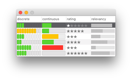
Note
This object should only be used in the columnDescriptions argument during the construction of a List.
from vanilla import Window, List, LevelIndicatorListCell

class LevelIndicatorListCellDemo:

     def __init__(self):
         self.w = Window((340, 140))
         items = [
             {"discrete": 3, "continuous": 4, "rating": 1, "relevancy": 9},
             {"discrete": 8, "continuous": 3, "rating": 5, "relevancy": 5},
             {"discrete": 3, "continuous": 7, "rating": 3, "relevancy": 4},
             {"discrete": 2, "continuous": 5, "rating": 4, "relevancy": 7},
             {"discrete": 6, "continuous": 9, "rating": 3, "relevancy": 2},
             {"discrete": 4, "continuous": 0, "rating": 6, "relevancy": 8},
         ]
         columnDescriptions = [
             {"title": "discrete",
             "cell": LevelIndicatorListCell(style="discrete", warningValue=7, criticalValue=9)},
             {"title": "continuous",
             "cell": LevelIndicatorListCell(style="continuous", warningValue=7, criticalValue=9)},
             {"title": "rating",
             "cell": LevelIndicatorListCell(style="rating", maxValue=6)},
             {"title": "relevancy",
             "cell": LevelIndicatorListCell(style="relevancy")},
         ]
         self.w.list = List((0, 0, -0, -0), items=items,
                        columnDescriptions=columnDescriptions)
         self.w.open()

LevelIndicatorListCellDemo()
style The style of the level indicator. The options are:
“continuous” A continuous bar. “discrete” A segmented bar. “rating” A row of stars. Similar to the rating indicator in iTunes. “relevancy” A row of lines. Similar to the search result relevancy indicator in Mail. minValue The minimum value allowed by the level indicator.
maxValue The maximum value allowed by the level indicator.
warningValue The value at which the filled portions of the level indicator should display the warning color. Applies only to discrete and continuous level indicators.
criticalValue The value at which the filled portions of the level indicator should display the critical color. Applies only to discrete and continuous level indicators.