DatePicker
- class vanilla.DatePicker(posSize, date=None, minDate=None, maxDate=None, showStepper=True, mode='text', timeDisplay='hourMinuteSecond', dateDisplay='yearMonthDay', callback=None, sizeStyle='regular')
A control for setting date objects
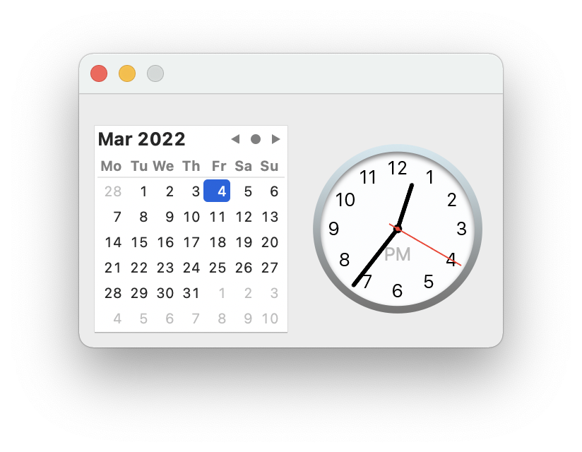
from vanilla import DatePicker, Window

class DatePickerExample:
    def __init__(self):
        self.w = Window((300, 180))
        self.w.datePicker = DatePicker(
            (10, 10, -10, -10),
            showStepper=True,
            mode="graphical",
            timeDisplay="hourMinuteSecond",
            dateDisplay="yearMonthDay",
            callback=self.datePickerCallback,
            sizeStyle="regular",
        )

        self.w.open()

    def datePickerCallback(self, sender):
        print(sender.get())


DatePickerExample()
posSize Tuple of form (left, top, width, height) or “auto” representing the position and size of the date picker control.
Standard Dimensions - Text Mode
Regular
H
22
Small
H
19
Mini
H
16
Standard Dimensions - Graphical Mode
Calendar and Clock
227w 148h
Calendar
139w 148h
Clock
122w 123h
date A NSDate object representing the date and time that should be set in the control.
minDate A NSDate object representing the lowest date and time that can be set in the control.
maxDate A NSDate object representing the highest date and time that can be set in the control.
showStepper A boolean indicating if the thumb stepper should be shown in text mode.
mode A string representing the desired mode for the date picker control. The options are:
“text”
“graphical”
timeDisplay A string representing the desired time units that should be displayed in the date picker control. The options are:
None
Do not display time.
“hourMinute”
Display hour and minute.
“hourMinuteSecond”
Display hour, minute, second.
dateDisplay A string representing the desired date units that should be displayed in the date picker control. The options are:
None
Do not display date.
“yearMonth”
Display year and month.
“yearMonthDay”
Display year, month and day.
sizeStyle A string representing the desired size style of the date picker control. This only applies in text mode. The options are:
“regular”
“small”
“mini”
- addAutoPosSizeRules(rules, metrics=None)
Add auto layout rules for controls/view in this view.
rules must be a list of rule definitions. Rule definitions may take two forms:
strings that follow the Visual Format Language
dictionaries with the following key/value pairs:
key
value
“view1”
The vanilla wrapped view for the left side of the rule.
“attribute1”
The attribute of the view for the left side of the rule. See below for options.
“relation” (optional)
The relationship between the left side of the rule and the right side of the rule. See below for options. The default value is “==”.
“view2”
The vanilla wrapped view for the right side of the rule.
“attribute2”
The attribute of the view for the right side of the rule. See below for options.
“multiplier” (optional)
The constant multiplied with the attribute on the right side of the rule as part of getting the modified attribute. The default value is 1.
“constant” (optional)
The constant added to the multiplied attribute value on the right side of the rule to yield the final modified attribute. The default value is 0.
The attribute1 and attribute2 options are:
value
AppKit equivalent
“left”
NSLayoutAttributeLeft
“right”
NSLayoutAttributeRight
“top”
NSLayoutAttributeTop
“bottom”
NSLayoutAttributeBottom
“leading”
NSLayoutAttributeLeading
“trailing”
NSLayoutAttributeTrailing
“width”
NSLayoutAttributeWidth
“height”
NSLayoutAttributeHeight
“centerX”
NSLayoutAttributeCenterX
“centerY”
NSLayoutAttributeCenterY
“baseline”
NSLayoutAttributeBaseline
“lastBaseline”
NSLayoutAttributeLastBaseline
“firstBaseline”
NSLayoutAttributeFirstBaseline
Refer to the NSLayoutAttribute documentation for the information about what each of these do.
The relation options are:
value
AppKit equivalent
“<=”
NSLayoutRelationLessThanOrEqual
“==”
NSLayoutRelationEqual
“>=”
NSLayoutRelationGreaterThanOrEqual
Refer to the NSLayoutRelation documentation for the information about what each of these do.
metrics may be either None or a dict containing key value pairs representing metrics keywords used in the rules defined with strings.
- enable(onOff)
Enable or disable the object. onOff should be a boolean.
- get()
Get the contents of the date picker control.
- getNSDatePicker()
Return the NSDatePicker that this object wraps.
- getPosSize()
The position and size of the object as a tuple of form (left, top, width, height).
- getTitle()
Get the control title.
- isEnabled()
Return a bool indicating if the object is enable or not.
- isVisible()
Return a bool indicating if the object is visible or not.
- move(x, y)
Move the object by x units and y units.
- resize(width, height)
Change the size of the object to width and height.
- setPosSize(posSize, animate=False)
Set the position and size of the object.
posSize A tuple of form (left, top, width, height).
animate A boolean flag telling to animate the transition. Off by default.
- setShowFocusRing(value)
Set if the focus ring is visible.
- setTitle(title)
Set the control title.
title A string representing the title.
- setToolTip(toolTipMessage)
Add tool tip message to the object when hover over it with the cursor.
- show(onOff)
Show or hide the object.
onOff A boolean value representing if the object should be shown or not.