CheckBox
-
class
vanilla.CheckBox(posSize, title, callback=None, value=False, sizeStyle='regular')¶ A standard check box.
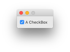
from vanilla import Window, CheckBox

class CheckBoxDemo:

    def __init__(self):
        self.w = Window((120, 40))
        self.w.checkBox = CheckBox((10, 10, -10, 20), "A CheckBox",
                           callback=self.checkBoxCallback, value=True)
        self.w.open()

    def checkBoxCallback(self, sender):
        print("check box state change!", sender.get())

CheckBoxDemo()
posSize Tuple of form (left, top, width, height) or “auto” representing the position and size of the check box. The size of the check box should match the appropriate value for the given sizeStyle.
Standard Dimensions Regular H 22 Small H 18 Mini H 10 title The text to be displayed next to the check box. Pass None if no title is desired.
callback The method to be called when the user changes the state of the check box.
value A boolean representing the state of the check box.
sizeStyle A string representing the desired size style of the check box. The options are:
“regular” “small” “mini” -
addAutoPosSizeRules(rules, metrics=None)¶ Add auto layout rules for controls/view in this view.
rules must be a list of rule definitions. Rule definitions may take two forms:
- strings that follow the Visual Format Language
- dictionaries with the following key/value pairs:
key value “view1” The vanilla wrapped view for the left side of the rule. “attribute1” The attribute of the view for the left side of the rule. See below for options. “relation” (optional) The relationship between the left side of the rule and the right side of the rule. See below for options. The default value is “==”. “view2” The vanilla wrapped view for the right side of the rule. “attribute2” The attribute of the view for the right side of the rule. See below for options. “multiplier” (optional) The constant multiplied with the attribute on the right side of the rule as part of getting the modified attribute. The default value is 1. “constant” (optional) The constant added to the multiplied attribute value on the right side of the rule to yield the final modified attribute. The default value is 0. The attribute1 and attribute2 options are:
value AppKit equivalent “left” NSLayoutAttributeLeft “right” NSLayoutAttributeRight “top” NSLayoutAttributeTop “bottom” NSLayoutAttributeBottom “leading” NSLayoutAttributeLeading “trailing” NSLayoutAttributeTrailing “width” NSLayoutAttributeWidth “height” NSLayoutAttributeHeight “centerX” NSLayoutAttributeCenterX “centerY” NSLayoutAttributeCenterY “baseline” NSLayoutAttributeBaseline “lastBaseline” NSLayoutAttributeLastBaseline “firstBaseline” NSLayoutAttributeFirstBaseline Refer to the NSLayoutAttribute documentation for the information about what each of these do.
The relation options are:
value AppKit equivalent “<=” NSLayoutRelationLessThanOrEqual “==” NSLayoutRelationEqual “>=” NSLayoutRelationGreaterThanOrEqual Refer to the NSLayoutRelation documentation for the information about what each of these do.
metrics may be either None or a dict containing key value pairs representing metrics keywords used in the rules defined with strings.
-
enable(onOff)¶ Enable or disable the object. onOff should be a boolean.
-
get()¶ Get the state of the check box.
-
getNSButton()¶ Return the NSButton that this object wraps.
This is currently not implemented for CheckBox.
-
getPosSize()¶ The position and size of the object as a tuple of form (left, top, width, height).
-
getTitle()¶ Get the control title.
-
isVisible()¶ Return a bool indicating if the object is visible or not.
-
move(x, y)¶ Move the object by x units and y units.
-
resize(width, height)¶ Change the size of the object to width and height.
-
set(value)¶ Set the state of the check box.
value A boolean representing the state of the check box.
-
setPosSize(posSize, animate=False)¶ Set the position and size of the object.
posSize A tuple of form (left, top, width, height).
animate A boolean flag telling to animate the transition. Off by default.
-
setTitle(title)¶ Set the control title.
title A string representing the title.
-
show(onOff)¶ Show or hide the object.
onOff A boolean value representing if the object should be shown or not.
-
toggle()¶ Toggle the state of the check box.
If the check box is on, turn it off. If the check box is off, turn it on.
-