SegmentedButton
- class vanilla.SegmentedButton(posSize, segmentDescriptions, callback=None, selectionStyle='one', sizeStyle='small')
A standard segmented button.
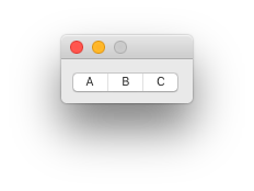
from vanilla import Window, SegmentedButton

class SegmentedButtonDemo:

     def __init__(self):
         self.w = Window((120, 40))
         self.w.button = SegmentedButton((10, 10, -10, 20),
             [dict(title="A"), dict(title="B"), dict(title="C")],
            callback=self.buttonCallback)
         self.w.open()

     def buttonCallback(self, sender):
         print("button hit!")

SegmentedButtonDemo()
posSize Tuple of form (left, top, width, height) or “auto” representing the position and size of the segmented button. The size of the segmented button should match the appropriate value for the given sizeStyle.
Standard Dimensions
Regular
H
21
Small
H
18
Mini
H
15
segmentDescriptions An ordered list of dictionaries describing the segments.
width (optional)
The desired width of the segment.
title (optional)
The title of the segment.
enabled (optional)
The enabled state of the segment. The default is True.
imagePath (optional)
A file path to an image to display in the segment.
imageNamed (optional)
The name of an image already loaded as a NSImage by the application to display in the segment.
imageObject (optional)
A NSImage object to display in the segment.
imageTemplate (optional)
A boolean representing if the image should converted to a template image.
callback The method to be called when the user presses the segmented button.
selectionStyle The selection style in the segmented button.
one
Only one segment may be selected.
any
Any number of segments may be selected.
momentary
A segmented is only selected when tracking.
sizeStyle A string representing the desired size style of the segmented button. The options are:
“regular”
“small”
“mini”
- addAutoPosSizeRules(rules, metrics=None)
Add auto layout rules for controls/view in this view.
rules must be a list of rule definitions. Rule definitions may take two forms:
strings that follow the Visual Format Language
dictionaries with the following key/value pairs:
key
value
“view1”
The vanilla wrapped view for the left side of the rule.
“attribute1”
The attribute of the view for the left side of the rule. See below for options.
“relation” (optional)
The relationship between the left side of the rule and the right side of the rule. See below for options. The default value is “==”.
“view2”
The vanilla wrapped view for the right side of the rule.
“attribute2”
The attribute of the view for the right side of the rule. See below for options.
“multiplier” (optional)
The constant multiplied with the attribute on the right side of the rule as part of getting the modified attribute. The default value is 1.
“constant” (optional)
The constant added to the multiplied attribute value on the right side of the rule to yield the final modified attribute. The default value is 0.
The attribute1 and attribute2 options are:
value
AppKit equivalent
“left”
NSLayoutAttributeLeft
“right”
NSLayoutAttributeRight
“top”
NSLayoutAttributeTop
“bottom”
NSLayoutAttributeBottom
“leading”
NSLayoutAttributeLeading
“trailing”
NSLayoutAttributeTrailing
“width”
NSLayoutAttributeWidth
“height”
NSLayoutAttributeHeight
“centerX”
NSLayoutAttributeCenterX
“centerY”
NSLayoutAttributeCenterY
“baseline”
NSLayoutAttributeBaseline
“lastBaseline”
NSLayoutAttributeLastBaseline
“firstBaseline”
NSLayoutAttributeFirstBaseline
Refer to the NSLayoutAttribute documentation for the information about what each of these do.
The relation options are:
value
AppKit equivalent
“<=”
NSLayoutRelationLessThanOrEqual
“==”
NSLayoutRelationEqual
“>=”
NSLayoutRelationGreaterThanOrEqual
Refer to the NSLayoutRelation documentation for the information about what each of these do.
metrics may be either None or a dict containing key value pairs representing metrics keywords used in the rules defined with strings.
- enable(onOff, indexes=None)
Enable or disable the object. onOff should be a boolean. If indexes is given, only that indexes in that list will be changed. If indexes is None all segments will be changed.
- get()
Get the selected segment. If this control is set to any mode, the returned value will be a list of integers. Otherwise the returned value will be a single integer or None if no segment is selected.
- getNSSegmentedButton()
Return the NSSegmentedControl that this object wraps.
- getPosSize()
The position and size of the object as a tuple of form (left, top, width, height).
- getTitle()
Get the control title.
- isEnabled()
Return a bool indicating if the object is enable or not.
- isVisible()
Return a bool indicating if the object is visible or not.
- move(x, y)
Move the object by x units and y units.
- resize(width, height)
Change the size of the object to width and height.
- set(value)
Set the selected segment. If this control is set to any mode, value should be a list of integers. Otherwise value should be a single integer.
- setPosSize(posSize, animate=False)
Set the position and size of the object.
posSize A tuple of form (left, top, width, height).
animate A boolean flag telling to animate the transition. Off by default.
- setShowFocusRing(value)
Set if the focus ring is visible.
- setTitle(title)
Set the control title.
title A string representing the title.
- setToolTip(toolTipMessage)
Add tool tip message to the object when hover over it with the cursor.
- show(onOff)
Show or hide the object.
onOff A boolean value representing if the object should be shown or not.